

FOOD WASTE AND INVENTORY MANAGEMENT APPLICATION
FoodEco
Objectives | Research | Persona | Design Process | User Testing | Outcomes
Purpose
Americans throw away one pound of food per day; households are not only losing money but they’re leaving a larger environmental footprint and remaining complacent to food inequity. The purpose of this application is to facilitate a way that users can track their waste habits, reduce their environmental impact, save money, and even help those in need. Once we examine the hurdles that attach itself to eco-friendly planning and behavior we can begin solving the issue of throwing away in excess.
Approach
Features that promote motivation and accountability are two themes which will serve as the foundation of the user experience. This application will need to address brand development, inventory management, UI, iconography, ease of use, and fundamental interaction design.
Role
I served as the primary Product Designer and UX Researcher during this project

LOGISTICS
Category
Concept project for early-staged startup
Timeline
3 weeks (79 hours)
Full timeline breakdown can be viewed here

RESEARCH OBJECTIVES
Identify what people do with excess food
Gather insights into food buying behaviors
Uncover useful methods participants might employ to reduce food waste
Uncover what keeps users from reducing food waste
USER RESEARCH fINDINGS
Introduction:
Research was broken into two parts, each assessing behaviors around shopping, planning, consuming and waste mitigation. The research began as a survey (10 questions) which went out to 15 users who have a surplus of food, at least three times a month, and are passionate about the environment and reducing food waste. The demographic was not limited by age, gender, or household size. 5 participants were interviewed, one-on-one, thereafter, diving deeper into pain points and hurdles surrounding shopping, planning, consuming, and waste mitigation.
Findings and Insights:
Meal planners waste the least amount of food
People who purchased their food based off of a shopping list or a set weekly shopping plan threw away food the least amount. This remained the same for people who shopped more frequently than not. Those who did not create a meal plan threw away food much more often than their counterparts.
Meal variety contributes to waste
When participants want to try a new recipe they often have leftover ingredients that they don’t know what to do with. Often times, this leads to expired food in the fridge and/or pantry. With many participants shopping based off a recipe they found, this may leave to an overabundance of food waste.
Expired food, more often than not, is forgotten food
One trend that showed throughout interviews is that participants allow food to expire simply because they don’t know that food exists in their fridge or pantry. This could be due to a small cramped fridge size, having a shared fridge, buying ingredients that only serve a few meals, or lack of a shopping list/meal planning.
Participants want to donate food but don’t know where to go
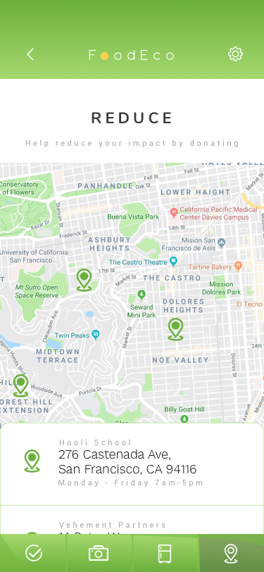
Every participant wants to donate their leftovers, perishable, or nonperishable foods but the larger majority don’t know where to go to do this. Participants were either new to the location, didn’t have time to find the local food banks, or didn’t know what the local food bank would accept. However, all participants would even be willing to do the leg work and travel to donate if these indicators were clear.
Participants don’t feel comfortable swapping food with someone they don’t know
Most participants would be willing to give food away but they don’t want to take food from someone else citing food safety issues, not getting what they were intended to receive, not knowing where it came from, etc. However, this greatly differed between swapping food with friends, family, or roommates, wherein 90% of users would be willing to swap food with someone they knew.
Goals and Needs:
Inventory management
Recipes based off of items already in their pantry/fridge/freezer
Easy and intuitive shopping lists
Motivation for reducing waste
Ability to track progress in waste mitigation
Alerts for expiration dates and leftovers going off
An easy way to find local donation locations
Overall:
5 out of 5 participants would not swap food with a stranger
5 out of 5 participants will use recipes when meal planning
5 out of 5 participants want meal variety
5 out of 5 participants forget about food in their fridge/pantry
5 out of 5 participants would like to donate food to local food banks
4 out of 5 participants have had leftover ingredients from a recipe
4 out of 5 participants rely on a shopping list
3 out of 5 participants consistently meal plan
3 out of 5 participants throw away food more often than they’d like
2 out of 5 participants shop more than once a week
2 out of 5 participants rely on freezing unused food
PERSONAS

Ideation & storyboard


Ideation and Storyboards were quickly done by way of a technique called “Crazy 8’s”. 84 sketches were made to uncover solutions.
These solutions were delineated by trying to solve three problem statements:
How might we solve food visibility issues in households
How might we encourage meal planning
How might we allow users to find locations and information about donation sites
Meal planning starts at home and should seamlessly follow users to the supermarket. However, planning may become difficult due to the lack of food visibility. Many sketches started following a pattern of giving users the ability to reduce by having a robust inventory management system. However, research tells us half of the users employ negative words when they describe grocery shopping (chore, obligation, time-consuming, etc.), so the solution needs to be as effortless as a piece of paper but as intuitive as a hefty database, with minimal effort on the user end. Ease-of-use continues on with the adding and removing of items in the inventory and shopping lists (including the addition of new lists). Recipes and easy meal planning based upon an already existing inventory may make planning simpler and easy to manage. A pivotal part of the sketching process was creating a motivator to get users to be accountable and have a desirable return rate to the application.
USER FLOW
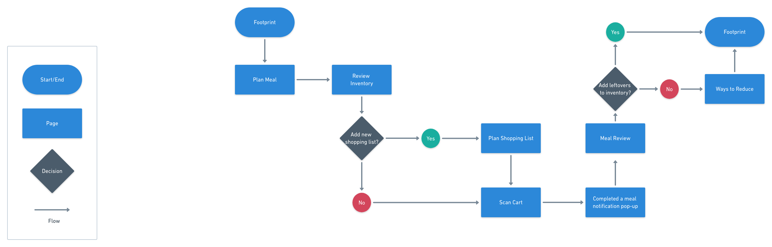
The happy path for this flow follows an already established user during their planning, shopping, reviewing and results of their behavior.
WIREFRAMES


Lo-fi Wireframes were employed to quickly sketch out solutions found during ideation. The user flow allowed for the blueprint of what screens would be integral to establish.
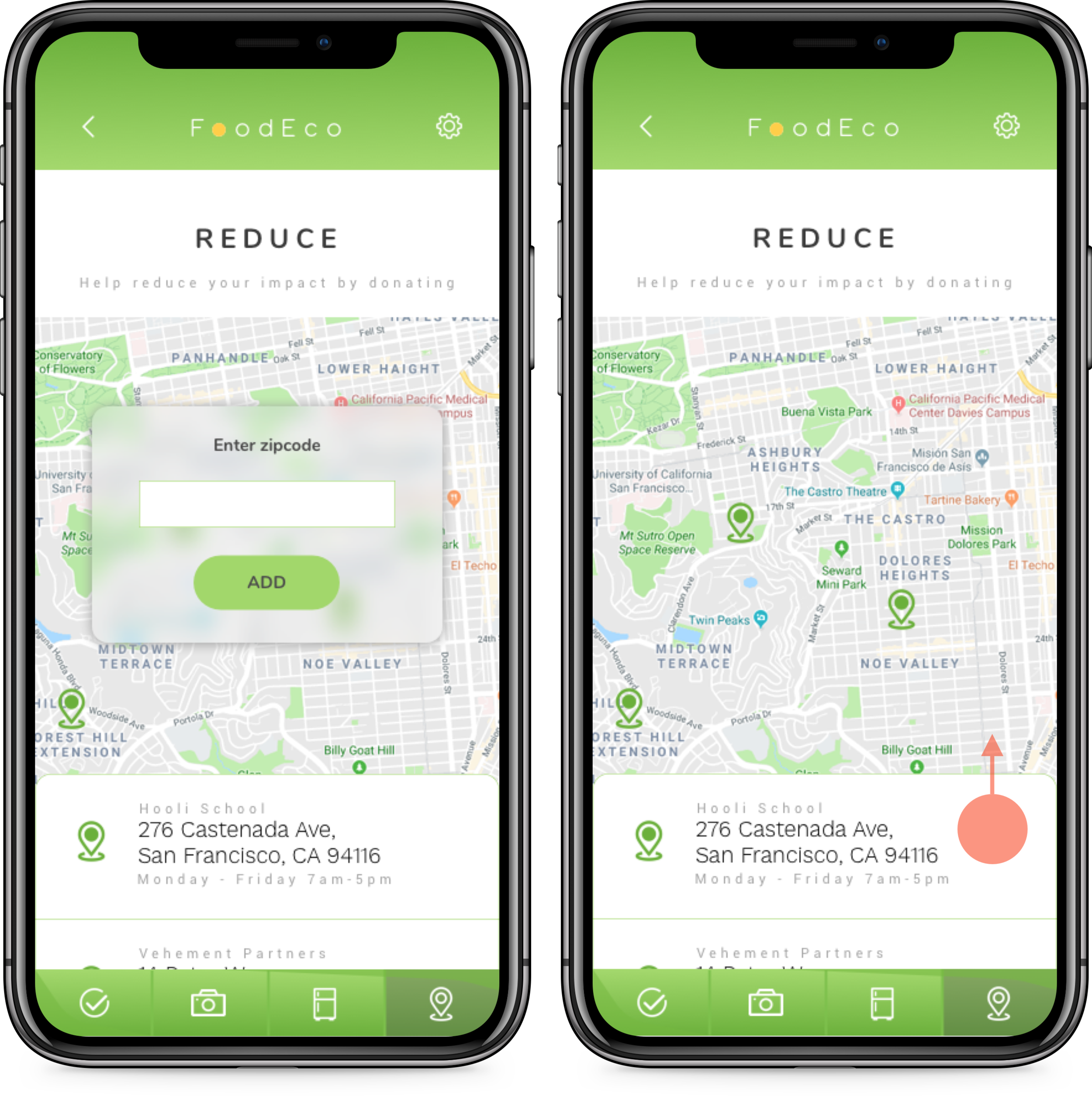
Navigation: Navigation will hinge on four primary destinations: Plan, Scan, Review, Reduce. Settings will be identified by the cog wheel in the top right, throughout. Back buttons will also be used throughout except on the homepage (where users will see their avatar, when signed in).
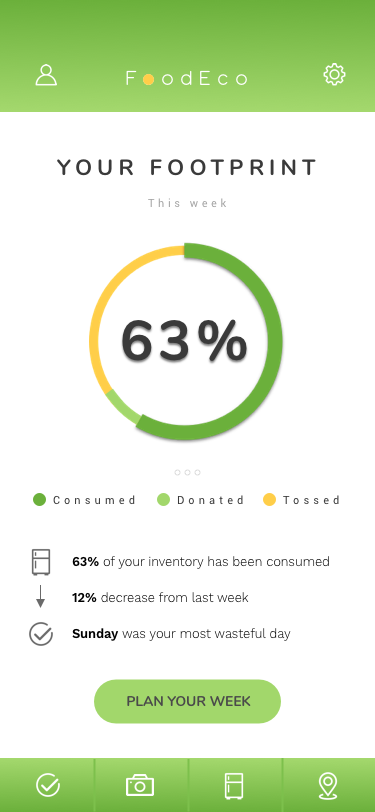
Home: the home screen will be used to motivate users to return the app and track their waste behavior, featuring an interactive segmented circle that gives an overview of consumed, donated, or tossed foods. This should have the run down of each week, swipeable, paging through previous weeks. From here users can start planning their current week.
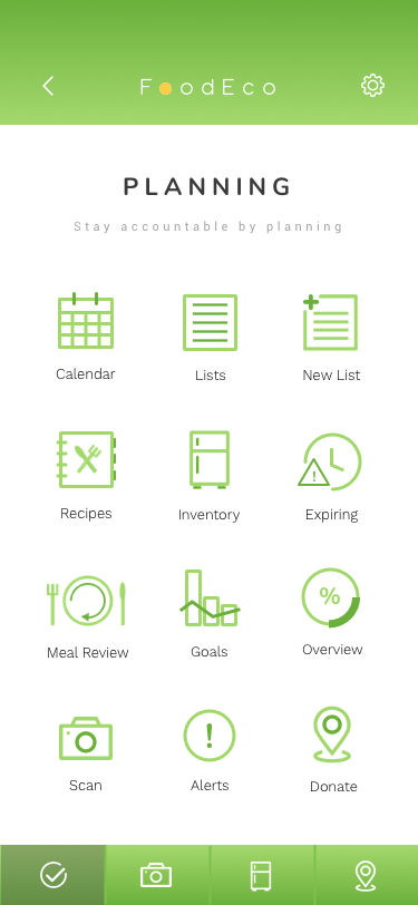
Plan: The planning page will house many of the features that FoodEco has. Recipes, inventory, shopping lists, calendar, donation locations, etc.
Shopping list: The shopping list will be a simple single-line list sequence, built of rows with dividers, by which users can manually create or import from specific recipes that they find within the app. Quantities or sizes can be controlled. List controls will be places on the lefthand side.
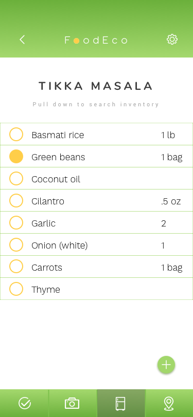
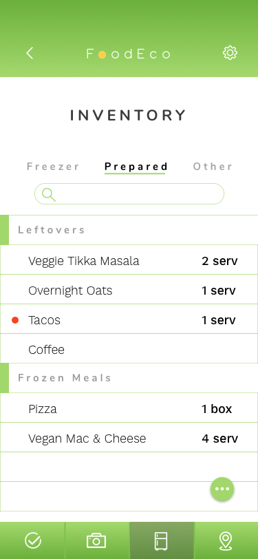
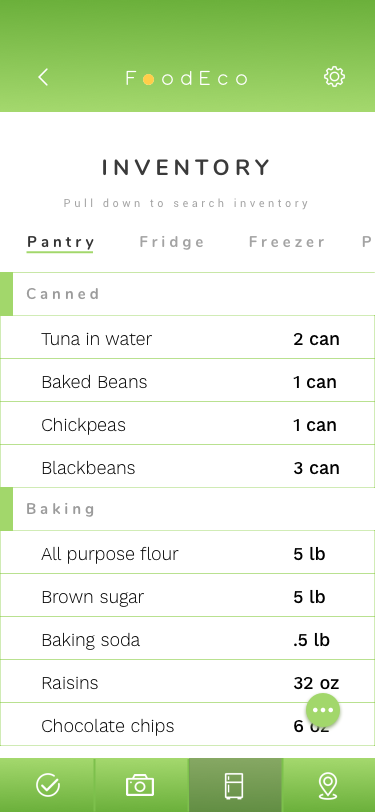
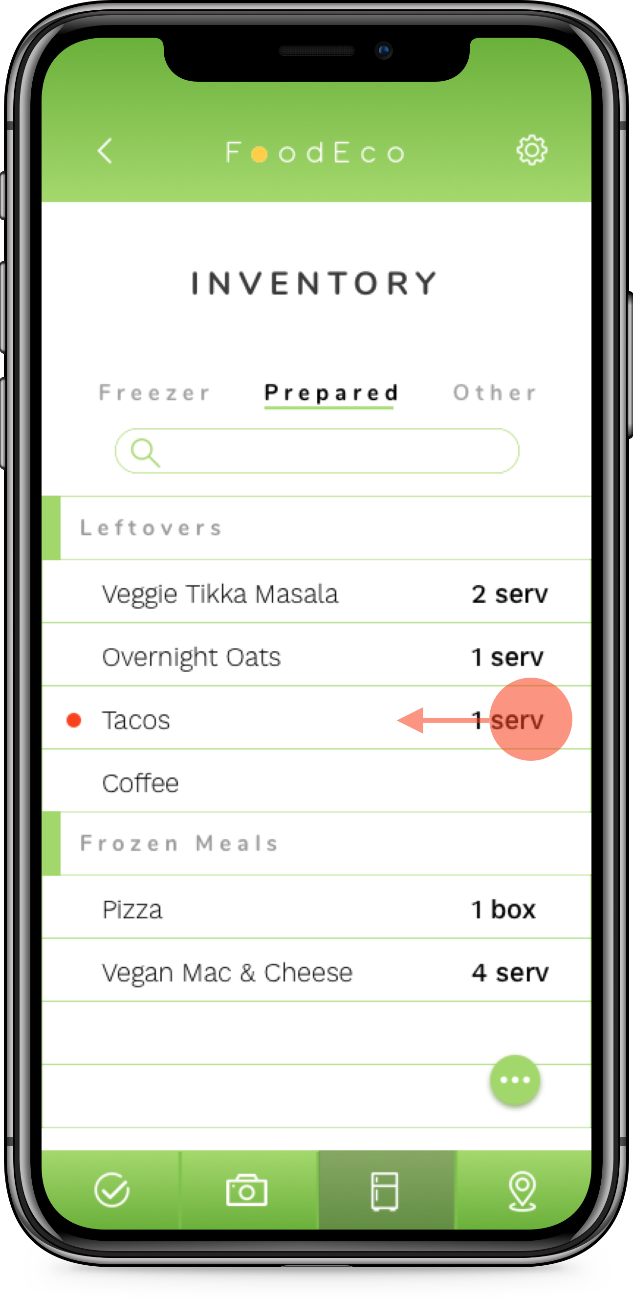
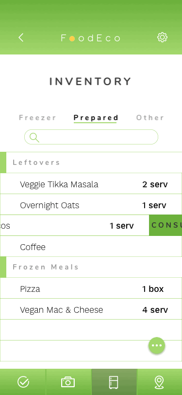
Inventory: Reflecting a layout much like the shopping list; the inventory system is based on 5 categories: fridge, freezer, pantry, prepared/leftovers, other. Inventory will allow users to see when an item is soon to expire (also prompting a notification). Users can then swipe to the left and decide on an action; consume, donate, or toss.
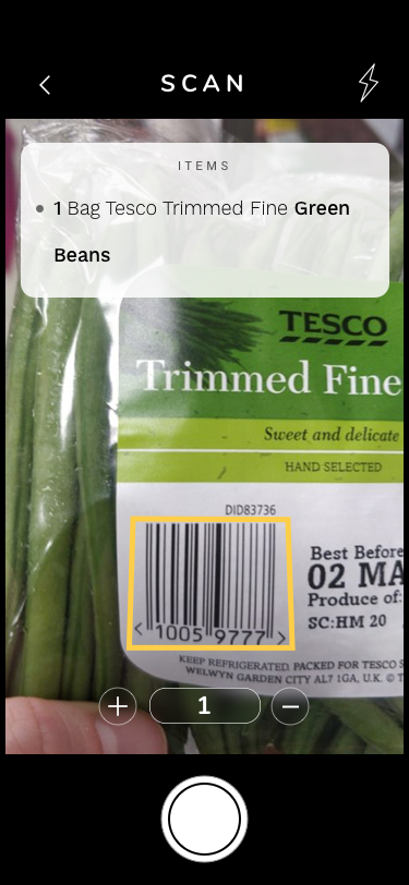
Camera Scan: Some users shop with lists, some don’t. However, users need to keep their inventory up-to-date. The scanning ability will account for items that need to be added to the respective inventory without manual entry. This is a standard camera layout with only front-facing capabilities, a back button, and flash.
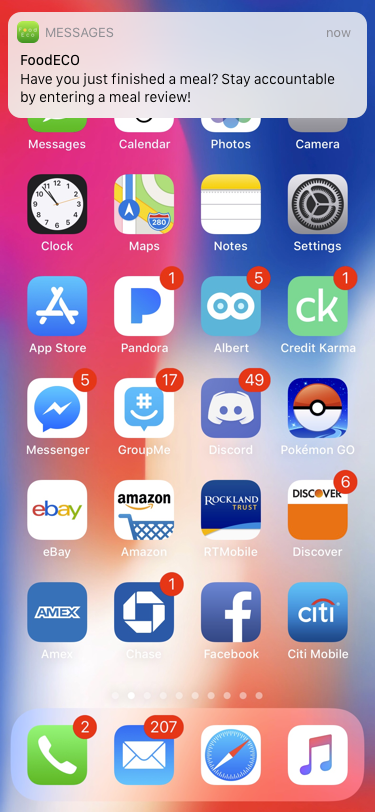
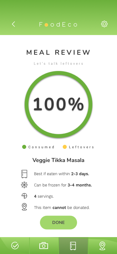
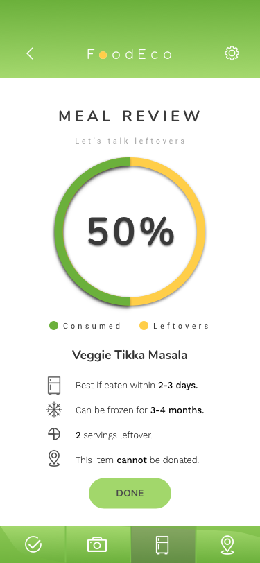
Meal review: In order to stay on top of inventory, leftovers, and expiration dates, users will need to review how much food is leftover after their meal. This review screen would be delivered via a notification and prompted by the calendar and specific identifiers like dinner being served around 5:00pm. (Onboarding would be provided upon sign up, to store these meal times, but the creation of sign up and onboarding is out of the scope of this project’s timeline). Meal review would employ the same segmented circle or a similar interactive feature where users can drag to control and record quantities.
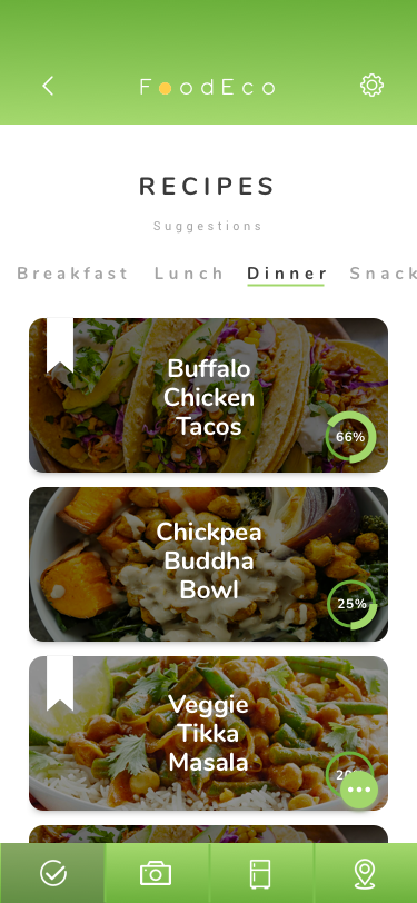
Recipe (not pictured): Many users like searching for new recipes and shopping based off the list of ingredients. The recipe page would allow for users to easily add items to their shopping lists, but also account for what they already have in their inventory, bypassing the addition of those items to their shopping lists.
BRANDING

Branding began with writing down ideas that reflected the mission of the app. By the end, it was clear that the brand needed to represent responsibility and accountability and reflect organizational planning and clean design with a modern typeface to reflect this.
Keywords: Donation, Leftovers, Food, Grocery, Produce, Perishable, Waste, Quantity, Size, Less, Eco, Clean, Conscience, Impact, Responsibility, Accountability, Foodies, Earth, Meal, Planning, Organization, Inventory, Moral, Money, Saving, Coin, Helpful
Potential Names: FridgeFriend, ProducePal, eQuantity, Grocery Hero, StoreMore, EcoShop, EcoStore, StorECO, ECOuantity
Adding a bit of fun to the name; FoodEco was a play on the word “Foodie” and “Eco-friendly”, lending itself to both the product’s mission and the product’s users. As shown in the wireframing, segmented circles, pie-charts, circular checkboxes, and rounded buttons would make up the bulk of the UI, so it made sense to go with a circular san serif font with rounded spurs and crossbars. The yellow circle was added in the logo to represent both that rounded consistency to the app but also the sun and/or a coin for savings. The hues of green and yellow lend itself to both the earthy mission of the app but also reflect trust and organization. Tracking between characters allowed the logo to breathe showcasing a more simplistic and modern look.
UI DESIGN
Iteration from lo-fi wireframes:
Navigation: reflects the original layout.
Home: reflects the original layout.
Planning: Planning was simplified to allow users easy navigation to most all of FoodEco’s features by way of their respective icons.
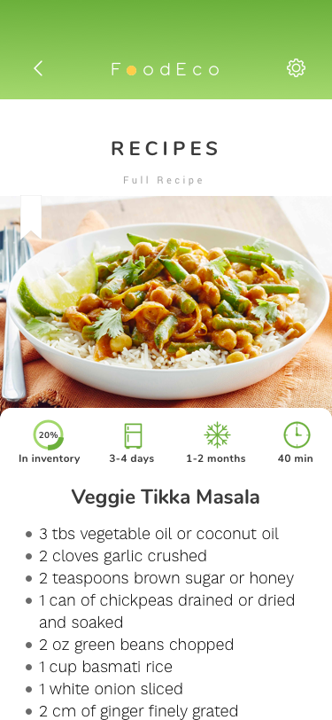
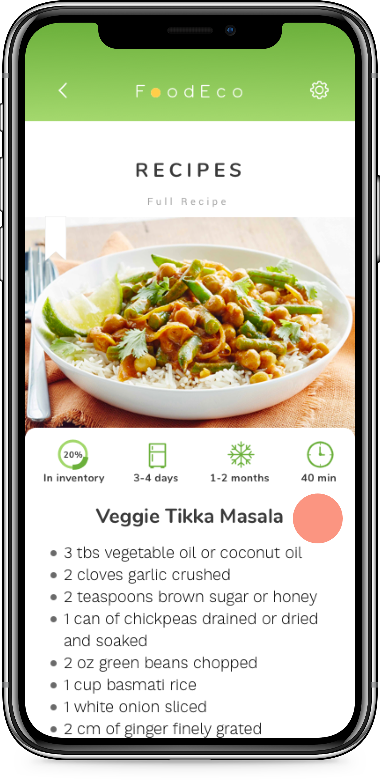
Recipes: the Recipe pages (overview of suggestions and the full recipe) has been added as two separate pages. One allowing users to see what meals they could make based off their inventory and one to add the necessary items to their shopping list or to read the full cooking instructions.
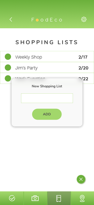
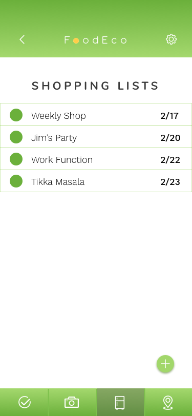
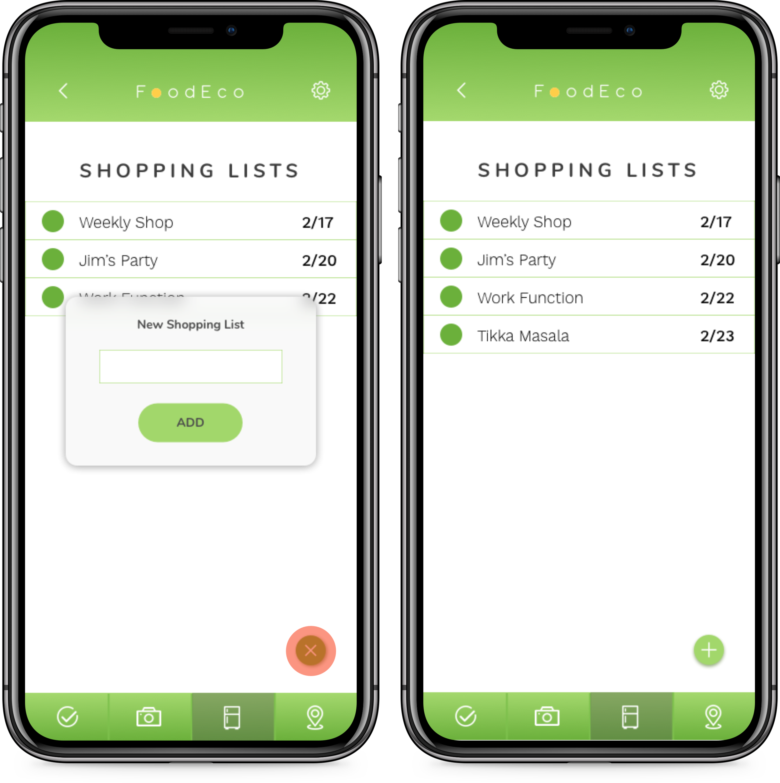
Shopping Lists: Adding a new list will now be done by using the floating action button and entering the title in a pop up overlay. Items added in from the Recipes page can alternatively be added into existing shopping lists. The “add” button has now been replaced with the floating action icon. Archived lists have been removed and a pull-down to search function has been added.
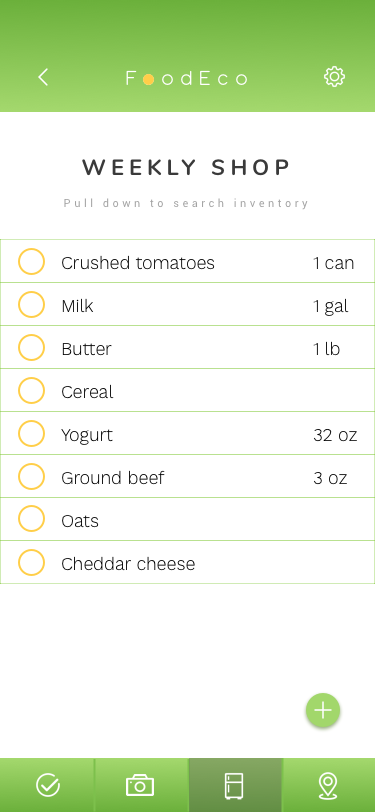
Weekly Shop: Weekly shop was an additional page to give usability testing participants an idea of what a basic shopping list would look like.
Scanning: reflects the original layout with the addition of an “items overview” summarizing what was scanned in. This overview can be exited by swiping up.
Tikka Masala: this is identical to the Weekly Shop list, except with the addition of the “green beans” being checked off.
Notification: the notification was added in to show testing participants how FoodEco would alert users for a Meal Review.
Meal Review: reflects original layout.
Inventory: reflect original layout.
Reduce: reduce has now been changed into a maps based layout where users can find local donation sites.
UI KIT

INTERACTION


MOCKUPS


USABILITY TESTING
Test Objectives:
Identify the ease of use and findability for the tasked features, throughout the app.
Assess participant’s comprehension as to the flow of navigation and the app’s capabilities.
Identify pain points in learnability and/or navigation.
Test Participants:
4 participants, targeting users who shop with lists, plan meals, end up with a surplus of food at least three times a month, and/or have environmental priorities in regards to food waste.
Methodology:
Participants will be given a clickable prototype (found here) and will be given a task. Participants will be asked to complete the task, talk through their behaviors. Application success will be gauged on how participants meet the objectives.
Recruiting plan:
One participant agreed to join in the usability testing during the user research phase. All other participants were volunteers pulled from Slack and social media platforms, who meet the participant prerequisites.
Tasks:
Participants will be tasked three different flows:
(Scenario: planning for a meal). Navigating from the homepage and adding a specific recipe into a new shopping list.
(Scenario: shopping in the grocery store). Scanning a grocery item and navigating to their shopping list to see that it’s checked off
(Scenario: post-meal review and reviewing potential donation sites). Reviewing a meal that was just consumed, indicating 50% of the meal is left over, locating the leftovers in their inventory, and identifying potential donation locations..
Test Completion Rate:
4 out of 4 users were able to complete all tasks creating a 100% success rate.
USABILITY RESULTS
All test participants noted the colors, font, and sizing as being legible and pleasing, however, there were notes about some language being unsuitable or confusing, in certain contexts. The green tones may need to be adjusted, as one user found it difficult to tell the difference between. One resounding result is that participants wanted to see a one-time tutorial overlay upon their first time using the app, to speed up the learnability process (this was especially true for the recipes page). After which, the features and abilities become much more clear. Half of the users noted the inventory icon indicator on the suggested Recipes page was ambiguous and, at times, covered up by the floating action icon. Half of the users had difficulty exiting out of the Scanning page and took a moment to recall the back button located at top left. Users commented on having to scroll (depending on phone size) to add a new shopping list. During the Meal Review task one user pointed out that dragging to identify “leftovers”, based off a percentage, would not only be cumbersome but it would be unclear. Example: defining having only 12% of a meal left. This is not sufficient to the serving-size experience that most consumers have come to know. Serving-sizes should also be considered in the Full Recipes page so that users can determine the quantity that a meal makes. Having the ability to adjust serving sizes, via the Recipes page filter, would also be desirable. One user noted that adding items from the Recipes page to a shopping list was a bit ambiguous, likening the experience of copying text but not knowing what text was copied. All pain points will be considered in the next design iteration.
AFFINITY MAP
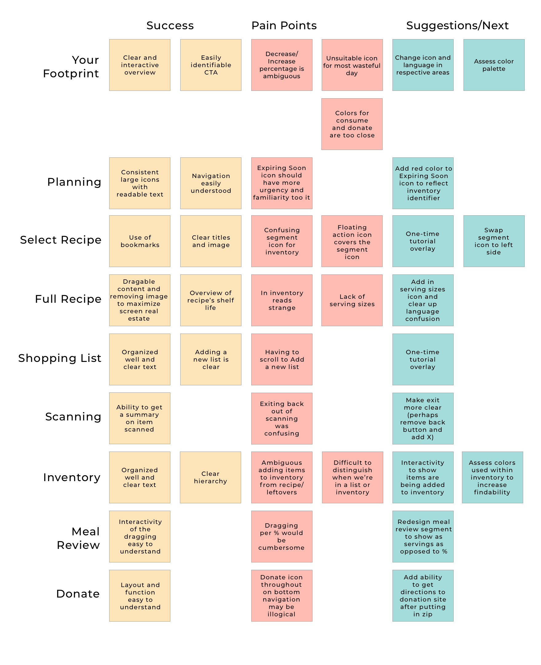
Overview of uncovered successes, pain points, and suggestions of each page noted during the usability testing.
Next Steps
More usability testing will be done after a series of iterations to assess the addition of the action icon, language and context adjustments, reexamining the color palette of the segmented pie charts, and redesigning the Meal Review pie chart. After a successful iteration covering context and design decisions, additional features will be considered, given the nature of the problem FoodEco is serving to tackle. Additional features may including adding the ability to have more than one inventory (to open up the demographic for those with more than one house, college students, caretakers, or business owners), adding a feature to track money savings, and daily tips to reduce food waste. User research will be applied to determine the necessity of new features.
HUNGRY FOR MORE PROJECTS?
Get your fill here